paid partnership with Fishpools
I know, I know, I’ve been planning my bedroom for a really long time now (yes yes, I STILL have the 90s blue wallpaper on the wall. We discovered damp, and had to fix the cause of that before we redecorated. This year though, eh?). But when you take a while in the planning, it means you get to spend long hours musing over what you want, what will work best and what will last you (potentially another twenty years… *cough*).
Your bedroom should be all about you. Keep it simple with neutral colours, got for a rustic vintage look with mismatched furniture or make a statement with some drama and bold colour choices. Ultimately, whatever style you choose, your bedroom should be your private retreat. It should be the one place in your house where you shut the door and feel safe and at peace. And that means making it work on a practical level – but also on a visual, emotional one too (trust the woman who’s been living with the 90’s blue floral for 20 years).
So here’s the results of my current thinkings, looking at the best Master Bedroom Decorating Ideas and trends for 2019…
1. Organised Mess
This one’s been around for a while, and looks like it’s here to stay. Some people love a clean, minimalist, contemporary room – but more of us feel at home with a little casual mess.
I read recently that the Kondo method of decluttering can actually cause stress – a towel folded wrong in a casually messy house doesn’t cause a flutter of an eyelid. if your house is supremely organised to within an inch of itself and there’s a rumpled towel though… good lord, your blood pressure will rise the minute you spot it – and you’ll spot it at 100 paces, of course.
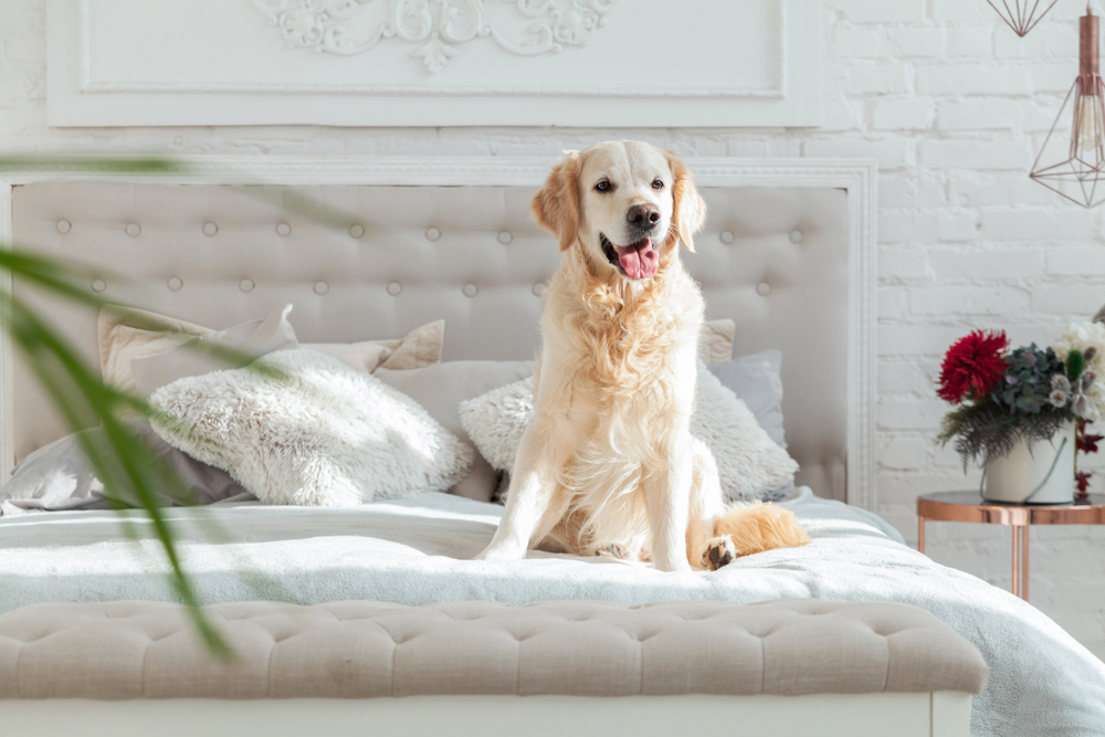
No one wants to live in chaos – but a little organised mess is simply comfortable, and less pressure; particularly in a family home.
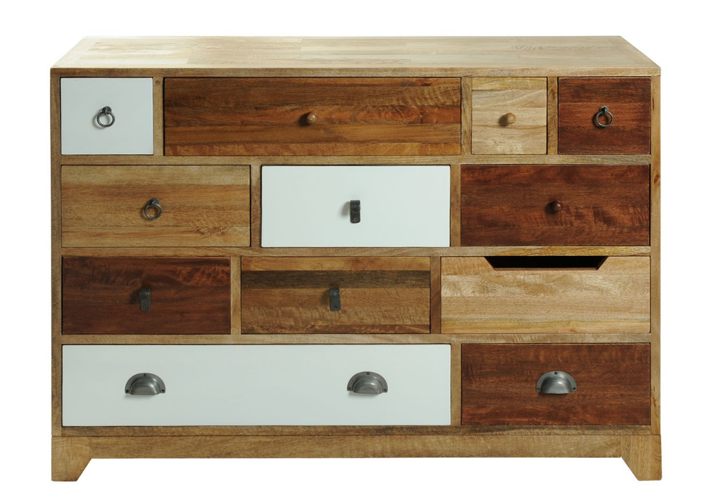
You can easily tie your furniture in with this idea; a bedroom furniture set could be sharply chic and pure white, of course – and it’ll frankly scream at you if you leave your tub of moisturiser out in the side. But choose softer tones in a more eclectic design, and your hairbrush can stay out all day without your chest of drawers caring a drawer knob.
2. White with a Pop.
Another one which first showed up in my consciousness in the 80s – bright pops of colour clamouring for your attention from the white. it can be noisy and overpowering – but used carefully, it’s a perfect mix of calm and energy.
You can go for a white room with pops of bright colour, or choose a bright colour to set off the white. It doesn’t matter – the essence is pure brightness in a rainbow of colours, no gentle shades and pastels and barely-there apologies for a colour with this one.
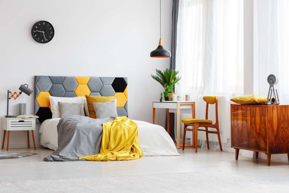
3. Mid-Century Elegance
The chunky heft of the 30s and 40s furniture waned, and in the 1950’s a new design style for clean-lined smooth elegance. Think Italian designed sleekness; strong simple lines with an unfussy minimalist approach to any extras.
No carved edges, twisty legs, fancy door furniture… stylishly practical furniture in organic material is back in fashion. Though to be fair, I’m not sure Mid-Century Modern design ever goes out of style.
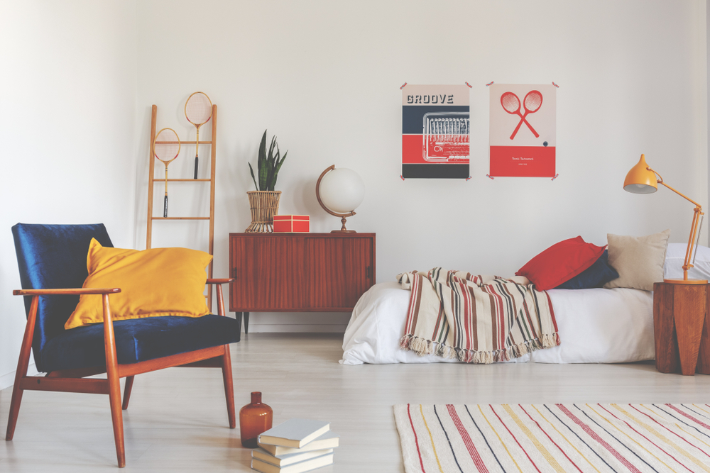
4. 70’s Retro.
Well, okay, not quite the 70s mad and blotchy orange & brown walls that we all remember with such horror/love. But I’m absolutely loving the return of those big bold prints, and mad kitschy looks.
Anything that makes me smile is frankly a win.
It can be glam, it can be groovy, but 70s retro is never going to be dull. Use it wisely though – a few statements sprinkled through your room are more than enough; one boldly printed feature wall, add a shag pile rug, a velvet headboard and don’t forget a few tropical houseplants (in a macrame hanger perhaps?).
5. Go Naked
No, not THAT sort of naked (hey, no judgement though; your bedroom, your rules). We’re talking bare concrete. I now, sounds grimly industrial. And yet, softened with some natural wood and warmly coloured soft furnishings, it looks amazing.
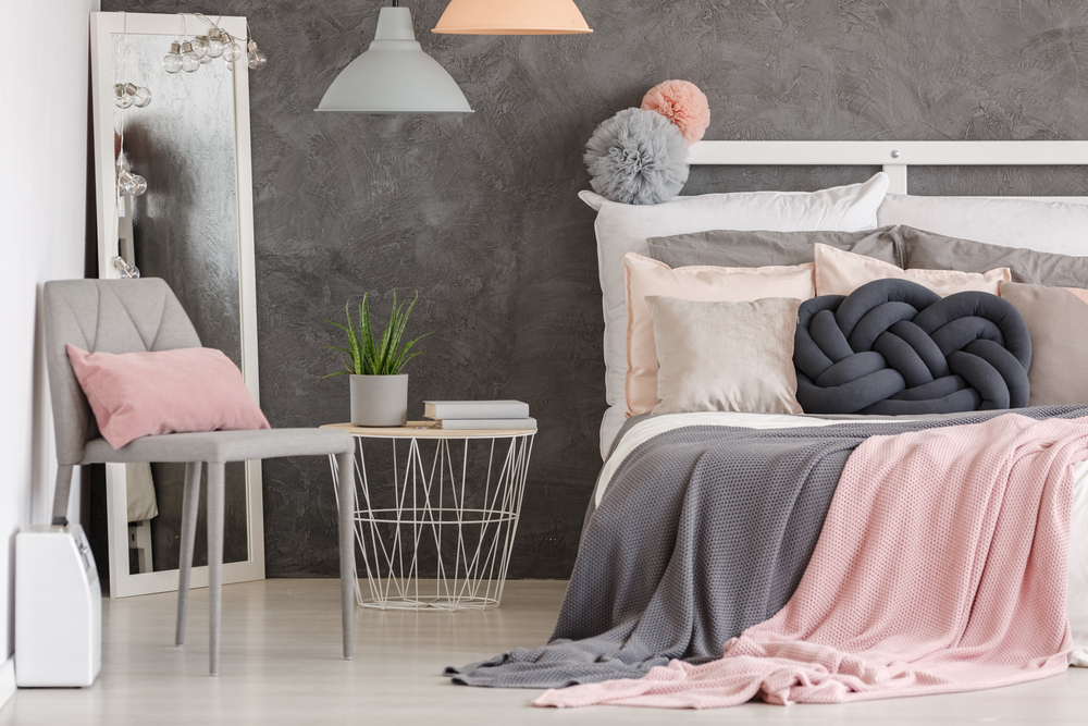
Far from cold and austere, treat the room as a whole and a concrete wall adds texture, character and charm,
6. Go Industrial
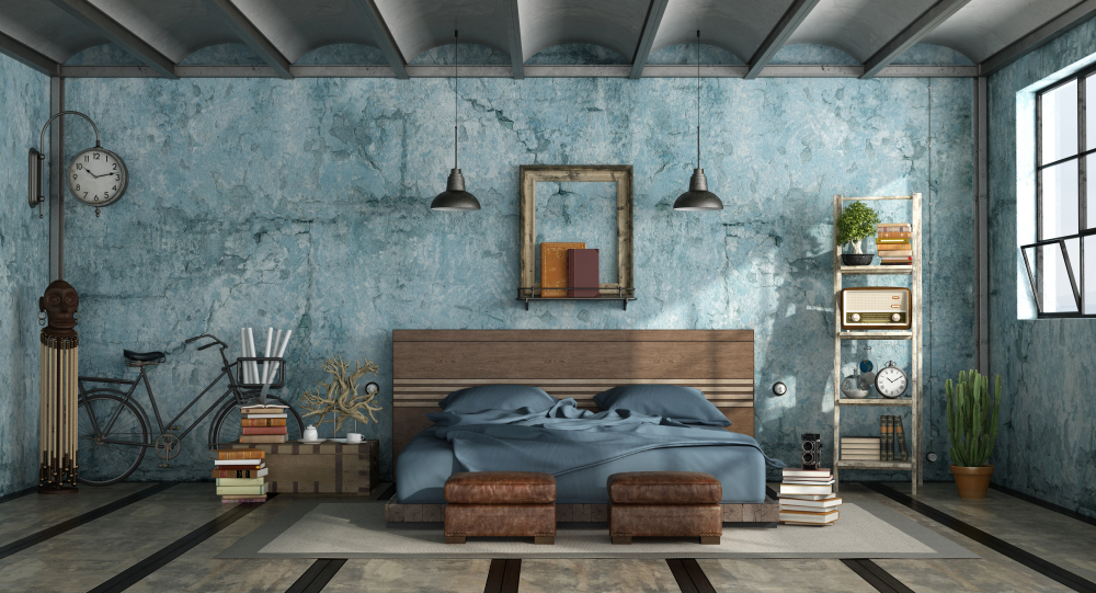
We’ve been seeing industrial kitchen design for years – and it’s finally made it to the bedroom. Pretty much the opposite of Mid-Century modern, this is all about hard, battered utilitarian options, softened with some fabulously rich yet soft tones; think rich petrol blues, deep indigo, brick orange… loving the variety of Industrial Bedroom designs in this collated post on home-designing.com.
7. Minimalist Plus
So you love the Minimalist look… you strip the room, you remove the extras, you hide the small bits in drawers and you’re done, you step back… and feel there’s something innately missing. Because sometimes, minimalist is a little too… minimal.
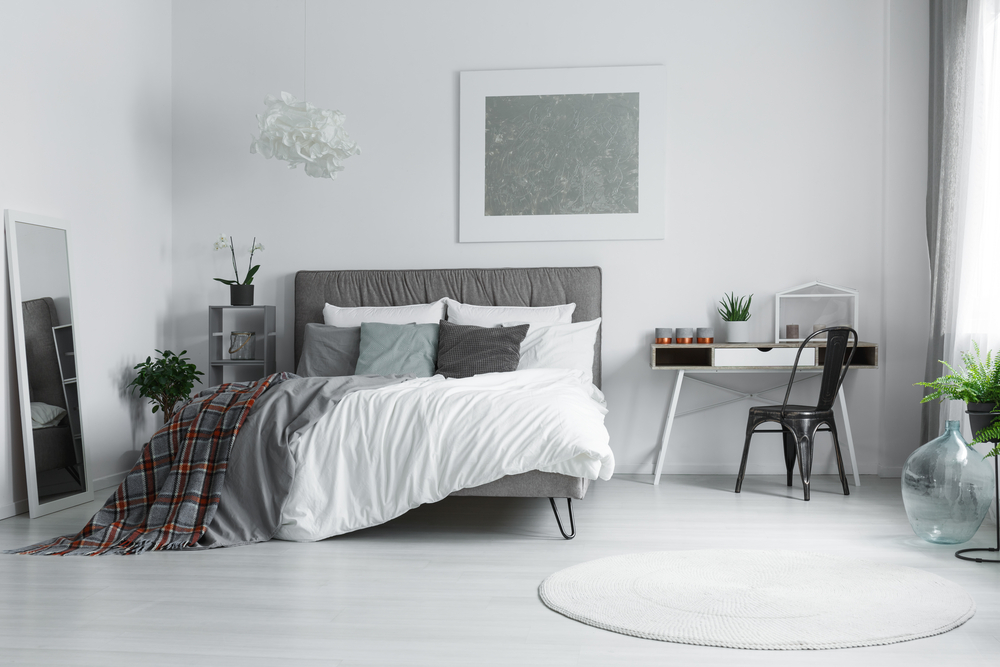
So you splash out on a whacking great beautiful light fitting. Or an extravagantly glorious velvet throw. Or you pop a stupidly oversized fern in the corner. And hey presto – you love it. See? Minimalist.. plus a bit.


Trackbacks/Pingbacks